What does it take to create banner ads that drive clicks?
Sure, you’ve seen tons of them, but have you ever wondered which elements make them impossible to resist?
In this post, we’ll dissect 31 banner ad examples and show you why they stand out. And along the way, you’ll learn how to create eye-catching ads that banish “banner blindness” once and for all.
Let’s dive in.

What is a Banner Ad?
Banner advertisements are one of the first forms of digital marketing.
Hitting the scene in 1994, these horizontal or vertical rectangle-shaped advertising banners are basically the highway billboards of the internet.
They can be used as standalone marketing tools or as part of a larger digital marketing campaign. And while banner ads have evolved over time, the goal remains the same: to get users to click on them.
What Are The Keys to Successful Banner Advertising?
Let’s make your banner ad shine with these 4 golden rules of click-worthy ad creation.
1. Make Sure Your Ad Passes the Blink Test.
Can the reader understand your offer in the blink of an eye? Because that’s how much time you’ve got. So keep it simple sweetie.
2. Win the War of Attention with These Images
You don’t just need images in your banner ad campaign. You need a highly relevant image ad that tears them away from the information they’re actively searching for on that page.
3. Show Them This for More Ad Clicks
Your image has to pull double duty. It’s got to grab their attention and then show them what they’ll get if they click your ad. You may have to test a number of images before you find the best-performing one for your campaign.
4. Tell Them What to Do
Give them a strong call to action (CTA), so they’ll know exactly what to do next to get all the details on your must-have offer.
Check out these stellar examples.
31 Best Banner Ad Examples
1. E*trade

- The bright colors stand out on the page.
- The bold text gives its readers specific reasons to click.
- A brightly-colored button tells you exactly what to do next.
Advertising with vague promises are everywhere. An ad banner giving you an exact dollar amount (like the $600 here) is more rare, which makes it much more compelling to readers. It creates curiosity and makes you want to get more info, doesn’t it?
2. Zelle
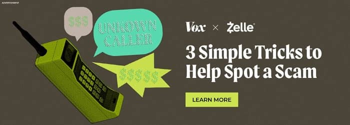
- The large banner with contrasting colors draws your attention.
- The headline does an exceptional job of making readers intensely curious.
- This ad focuses on helping the reader only.
Instead of promoting its services, this advertiser has teamed up with Vox to help its readers out with these tips to keep scammers away. After readers click the ad and learn about scammers, Zelle will show them more specific ads to promote their services (also known as retargeting).
3. Linkedin
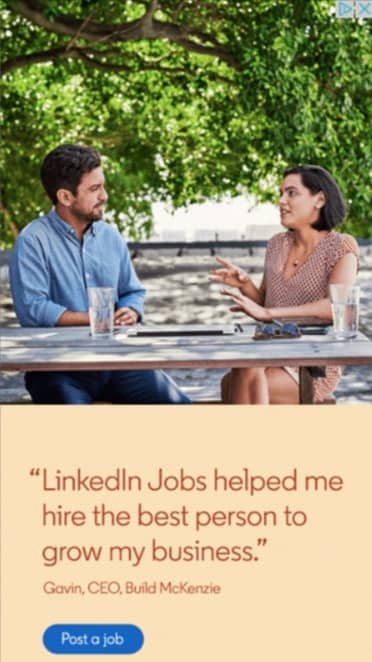
- Clearly states the result you’ll get by clicking the ad.
- Includes a testimonial in the banner advertisement.
- Eye-catching photo and bright blue button.
Linkedin knows how tiresome the hiring process can be for employers. Adding a testimonial right in the ad helps convince more businesses to click over for more information.
4. North Face

- Strong colors and relevant images
- The images and the text tell a captivating story that’s hard to ignore.
- This ad sends a memorable message about the North Face brand.
Even if you never click on this ad, it’s done a great job of reminding you that North Face isn’t just an everyday winter coat. An excellent example of an effective brand awareness ad.
5. Liberty Mutual

- Bright colors and quirky images get your attention.
- This banner ad gives you a specific reason to click: $947.
This ad does a fantastic job of brand awareness. If you somehow manage to resist clicking the first time, they’ll get your click eventually as your curiosity builds. Notice that it’s $947 and not $900 (which only makes it more intriguing).
6. AARP

- Large animated banner with bright red and white colors.
- This display ad promises to offer you help with no sales message.
- Perfect for finding your target audience for retargeting later.
This ad isn’t selling you a thing. It’s promising to help you stay safe. Your chances of noticing this bright red and white ad and clicking it for more information are high. And even if you don’t sign up for AARP after your first visit, they’ll send more ads your way with even more attractive reasons to give them a try.
7. DocuSign

- Strong contrasting colors and simple design get your attention.
- Good use of curiosity to make you click the ad for details.
- This ad offers you valuable information and nothing else.
DocuSign knows its target audience isn’t going to click over and sign up right away for their services, so their banner ad is offering valuable information to its potential customers. The headline and contrasting colors will get the readers’ attention. Once they click over, their easy yes offer could seal the deal (or they can retarget them with new more irresistible offers).
Related Reading: Paid Advertising in 2024: What it is (& How it Works)
8. Capital One

- The contrasting colors and large text draws your attention.
- The ad offers a very clear, specific reason to click it.
- Protecting its readers from future pain is an extremely tempting offer.
How did they manage to pack all this into 12 words? This simple Capital One banner ad makes maximum use of its small space. The large text does all the work drawing your attention, giving you a detailed reason to click, and making a big promise to save you money and time.
9. Square
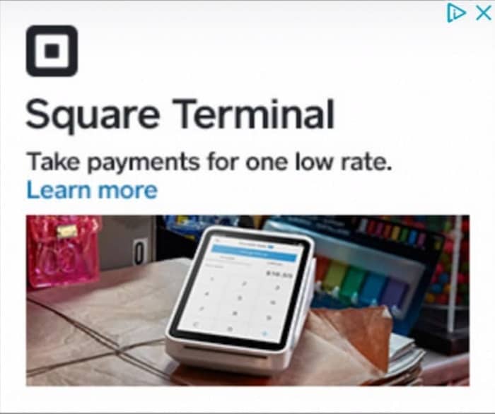
- This large ad’s size attracts your attention easily.
- The photo clearly shows you what you get.
- This headline will get their audience’s attention.
This ad example is hard to ignore. An enormous photo demonstrating the product in action plus the seductive proposal of taking payments “for one low rate” is hard to fight. Square knows how badly their potential customers dream of this.
10. Dreamworks

- The odd, colorful images catch your eye easily.
- The strange message and bizarre characters make you extremely curious.
- This brand awareness ad does its job whether you click or not.
The offbeat nature of the characters and the text almost makes you want to google it, doesn’t it? With repetition, Dreamworks will get you to click on it if you’re their target audience. A sensational brand awareness ad.
11. The Ridge

- Outstanding use of a photo to sell your product.
- This photo shows you exactly what you get if you click the ad.
- The text is simple and confirms the results you’ll get when you click.
This ad passes the blink test with flying colors. It communicates everything in less than 3 seconds: what you get when you click, the pain of not clicking, and a clear call to action. Ok sure, you’ll have to spend another second or two reading about the additional valuable features, but it’s a near-perfect use of an image in a banner ad.
12. Glassdoor
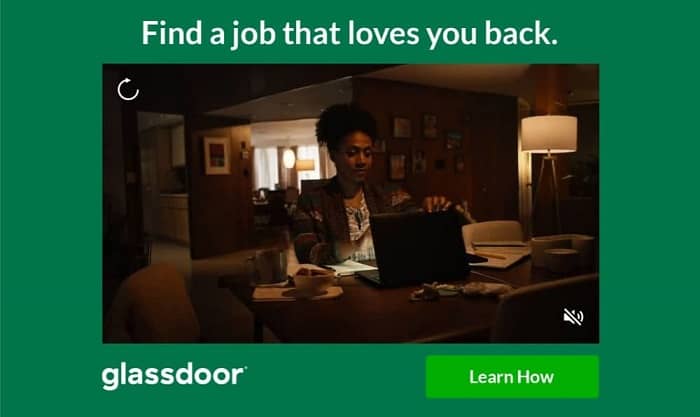
- Large, colorful ad with relevant images.
- Clever message that communicates precisely what you want.
- The bright button tells you what to do next.
This video ad shows multiple images telling the story of this woman as she navigates finding the right job. The video attracts attention. But the straight-to-the-heart “find a job that loves you back” message calls out to weary employees. A flexible ad format that works for Facebook ads or websites.
13. Lending Tree
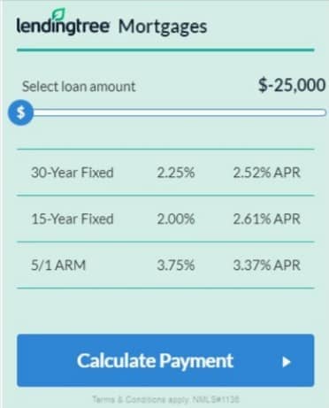
- Large attention-grabbing colorful banner ad.
- This ad offers answers to your burning questions.
- You can get the precise answers you want with this interactive ad.
This interactive ad entices readers with exactly the info they want. No sales message just yet. By offering help at the beginning of their home financing journey, they introduce their services to readers with perfect timing.
14. Keytruda

- Bright contrasting colors grab your attention.
- The text suggests a highly desirable future for its target audience.
- A low-key, friendly invitation to click.
The simple, but colorful banner ad design grabs your attention. Its viewers know explicitly what they can get. “Chemotherapy-free” jumps off the page and easily passes the blink test. The bright yellow “See for yourself” button offers a gentle nudge to take action.
15. Popeyes
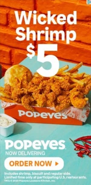
- The large, colorful image ad pulls your eyes to it.
- The clear image and price give you specific reasons to click the ad.
- This photo was carefully chosen to make you hungry.
Skyscraper ads like this one are easy to ignore, so Popeyes cranks it up with an outstanding banner design. The big bold product photo gets you salivating. Adding complementary blue and orange colors, a fantastic product name, and huge text size guarantees you’ll be thinking about Popeyes later.
Related Reading: Simple Guide to Social Media Advertising (+ Examples & Types)
16. Klarna
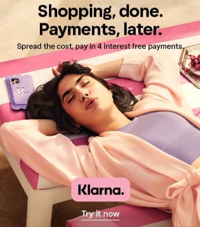
- The bright colors and relevant photo catch your eye.
- The headline and image promise exactly what readers want.
The perfectly blissful photo pulls your attention. The simple, clear-cut message in large text keeps you reading. This effective banner ad sticks with you even if you manage to restrain yourself.
17. WikiBuy

- This ad gives specific details about a product’s pricing.
- Good use of banner ads for brand awareness and retargeting.
Wikibuy communicates its value in less than 3 seconds with this impressive image ad. It uses its tiny space perfectly. You know exactly what you get (and what you risk losing) if you don’t click over. The green lettering emphasizes the no-questions-asked value WikiBuy offers you.
18. Purdue

- This ad tells you exactly what you can get by clicking it.
- The headline is clear and specific.
- A soft invitation works well for higher-priced offers.
The bright image and text with contrasting dark colors help draw your eyes. Purdue University takes on their biggest sales objection head-on, they give you more reasons to keep reading and get curious about it.
19. Apple

- This black and white ad draws your eyes to it.
- What you get is clear, specific, and eye-catching.
- The side-by-side comparison hits their audience’s pain points instantly.
The contrasting colors in this small ad get your attention. In just a few seconds you know what you’ll get or miss out on when you click on their ad. A stand-out example of brand awareness.
20. Peacock

- Bright colors and images grab your attention while scrolling.
- The freemium offer gives strong reasons to click.
- Clear “Stream Now” Call to Action button.
Peacock’s small banner ad uses bright text colors and popular TV show images to grab your attention. The free offer keeps you reading and makes you curious. The yellow button gives you a crystal-clear next step.
21. It Cosmetics
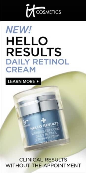
- Big, attention-grabbing product photo and text size.
- Great click-worthy product name entices you to find out more.
- The tagline hits a strong pain point for this product’s audience.
It Cosmetics have upped the amperage with an enormous bright product image, a captivating product name, huge text, and a hard-to-resist promise. Every part of this ad pulls its weight to get your click.
22. Smartwater
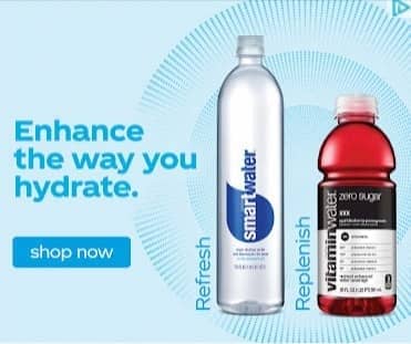
- Great use of product photos and eye-catching colors.
- The combo of images and text make you thirsty.
- The bold button calls you to take action.
Mikmak doesn’t waste any words in this ad. It does everything right to earn your click: bright colors, product images, and carefully-crafted suggestive text grab your eye and almost make you thirsty.
23. USA Today
![]()
- Very clear and specific benefit if you click this website banner ad.
- Added urgency with a deadline on this special price.
- Appealing call-to-action button.
This tiny but highly-effective ad gets readers’ attention and offers them an easy yes offer with a precise deadline. In a few seconds, you know exactly what you get plus a special price for a limited time. The “Go ad-free” button is the perfect call-to-action. Fantastic example of native advertising on USA Today’s website.
24. Mint Mobile
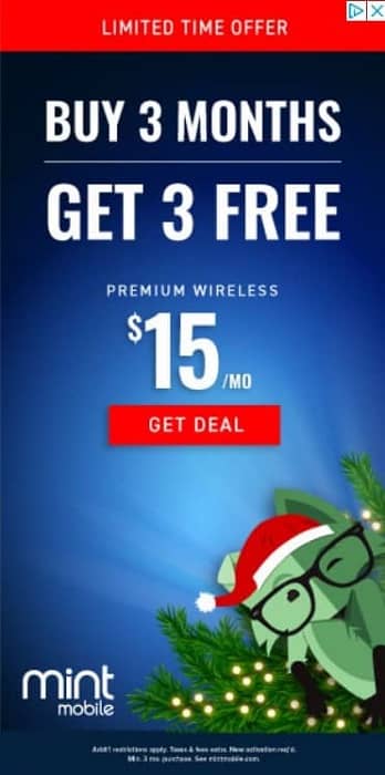
- This ad offers a very specific price.
- The limited-time offer adds urgency to the offer.
MintMobile’s skyscraper ad is stacking all the cards in their favor with bright, contrasting colors, enormous text you can’t miss, a big discount, added urgency with a limited time offer, and a straight-to-the-point “Get deal” button.
25. Planet Fitness
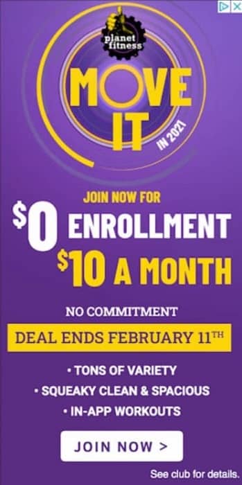
- This large, colorful ad is hard to ignore.
- It gives you clear and detailed reasons to act now.
- The promo deadline gives you an extra reason to click now.
Planet Fitness’s limited-time offer gives potential customers every reason to click the ad and get more info. You could call it an “easy yes” offer. This too-good-to-pass-up offer is guaranteed to compel clicks and make sales.
26. Neutrogena
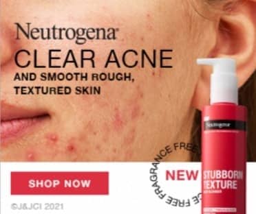
- This colorful image ad grabs your attention.
- The well-chosen images hit their customers’ pain points directly.
- This product’s great name and ad text announce exactly what you get.
This ad places acne sufferers’ worst nightmare front and center, right next to the perfectly-named Stubborn Texture Acne Cleanser. Their target audience is naturally compelled to click on the ad.
27. Microsoft

- Bright blue and contrasting white colors catch your attention.
- A unique and compelling free trial.
- The clear and simple call-to-action button tells you exactly what you get.
Microsoft’s Azure app developer ad takes the typical “free trial” offer to a new level. They give their readers full control over the app testing period instantly making this ad more click-worthy.
28. Fiber Choice

- This ad creates curiosity about the reader’s health.
- This interactive ad invites you to get your fiber score.
This interactive ad is the perfect invitation to help readers without trying to promote an offer directly in the ad. They can retarget site visitors with new more specific ads afterward.
29. MailChimp

- Odd but relevant photo and bright colors
- Precise results MailChimp’s audience wants.
Mailchimp’s headline hits readers right in their emotions by pressing a major pain point for all tech-users. Even if you don’t click this banner ad, you’ll remember this company.
30. Semrush

- Bright contrasting colors and rich media helps this ad stand out on the page.
- The ad promises very specific results.
- “Competitors’ top products and offers” is a captivating result for business owners.
Semrush’s seductive promise to solve your biggest business problem in seconds is difficult to resist. Even if their audience manages to scroll by it, that enticing offer will stick in their head. A great example of an outstanding brand awareness ad.
31. Yummly

- The large animated gif with bright colors grabs your attention.
- The photo shows you exactly what you can get when you click the ad.
Yummly knows how to get your attention and make you feel good about yourself. They’re only looking for smart cooks (or friends of smart cooks). In their banner ad, you can clearly see how their smart thermometer will make your cooking easier.
Say Bye-Bye to Banner Ad Blindness
Creating captivating ads takes practice.
With these eye-grabbing examples as your guide, your ad designs will get more and more clickable with each project.
Youtube, Facebook, website, and mobile ads will soon be your forte if you stick with it.
So, are you ready to get to it?
Looking at ad examples, getting inspired, and reviewing marketing wisdom are solid places to start.
Now it’s time to do the work.

Great analysis, and useful takeaways, thanks!
I love the LinkedIn ad Suzanne because it shows human beings, not things. Humans do the odd thing of advertising things. People believe things bring happiness, peace of mind and freedom. As in, advertising money-profit potential seems enticing because people believe money is freedom. Not true. Money is a symbol. Freedom – like peace, fun, etc – are all states of mind.
LinkedIn hit the mark because seeing humans reminds us that all advertisements are directed toward humans to enhance our experiences with humans. Even though this sounds a bit odd it is 100% true. We all crave the amazing feeling of connecting with humans more than anything else.
Great list of ads, here.
Ryan
Hi Ryan,
Glad you’re enjoying the ads (I like the Linkedin one a lot too).
Suzanne
Hi Suzanne, I love Popeyes. It shows the product and the price. No need to be fearful of the cost of the product there. Oftentimes you don’t see the cost on the banner ads. But with the price, it would make me click. You just gave me some ideas 🙂 Thank you!
Hahaha. The Popeyes ad made me hungry and got rid of my objections with that price! Would have got in my car and headed over if we had one nearby 😉
Glad it gave you some ideas.